commissions header.png

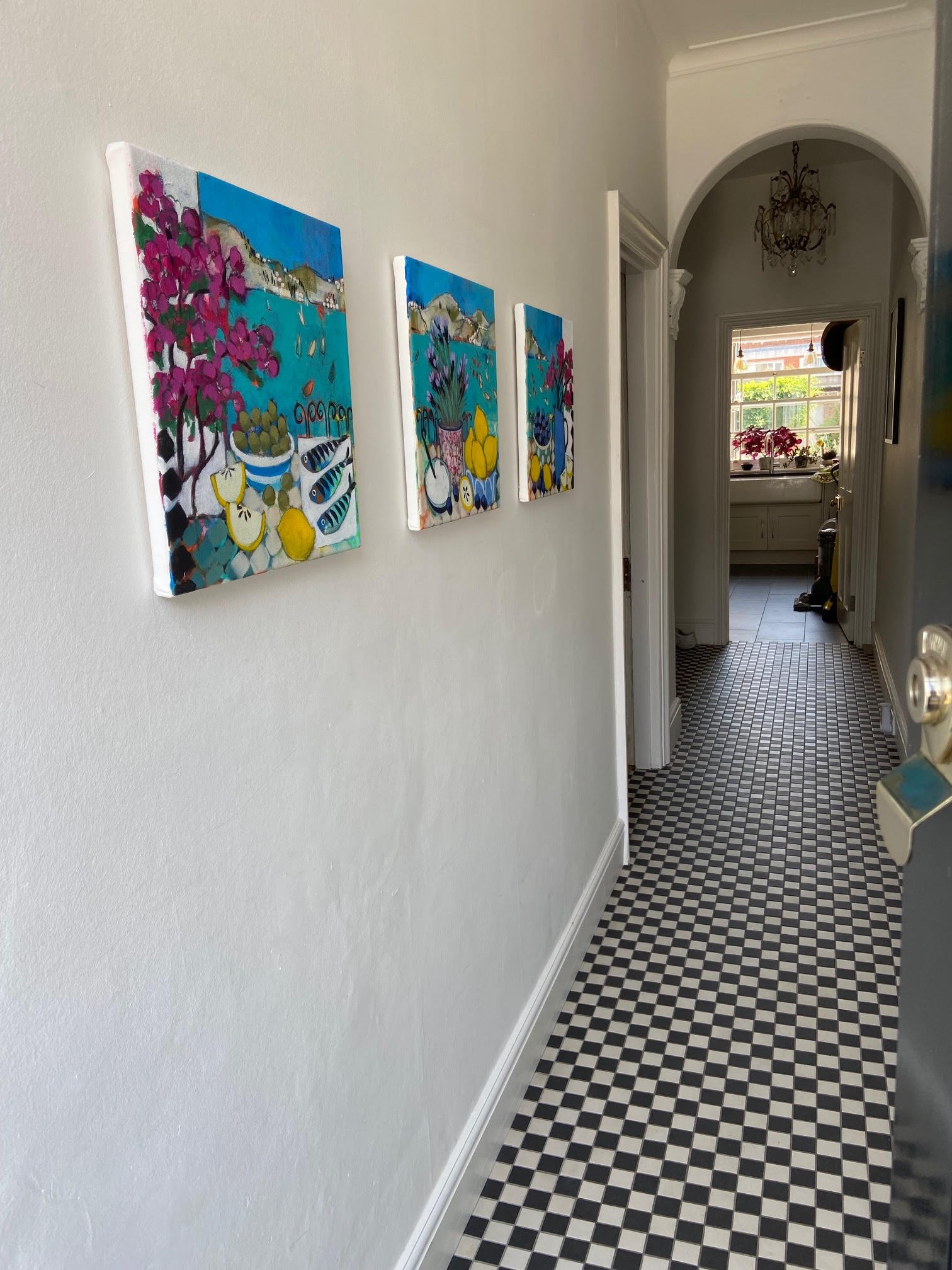
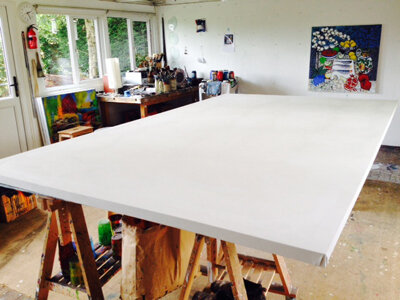
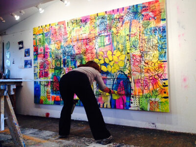
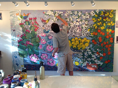
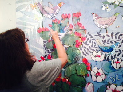
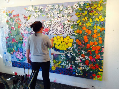
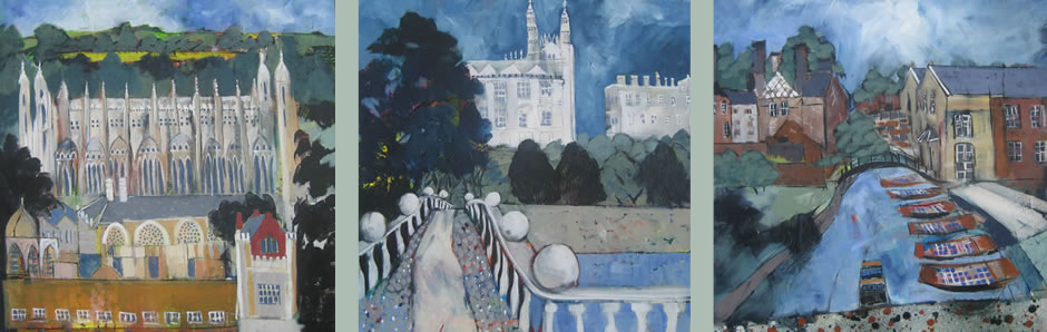
 We LOVE to paint to commission and have completed many successful pieces over the years. It brings an extra layer of challenge to the painting process and we always learn something new along the way.

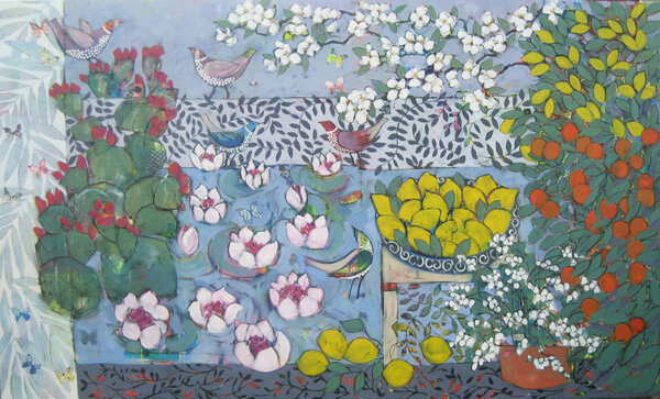
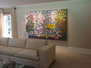
A typical commission will begin with the client giving us information:- the exact dimensions of the work, where it will hang and what kind of imagery they would like to see. We often work from images of existing paintings, where the client sees a piece they like but would prefer something similar but at a different size or with some changes to the image.

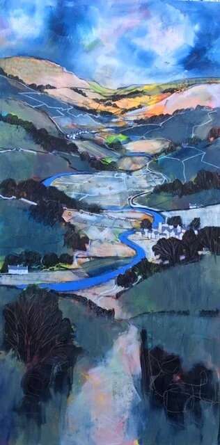
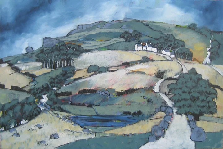
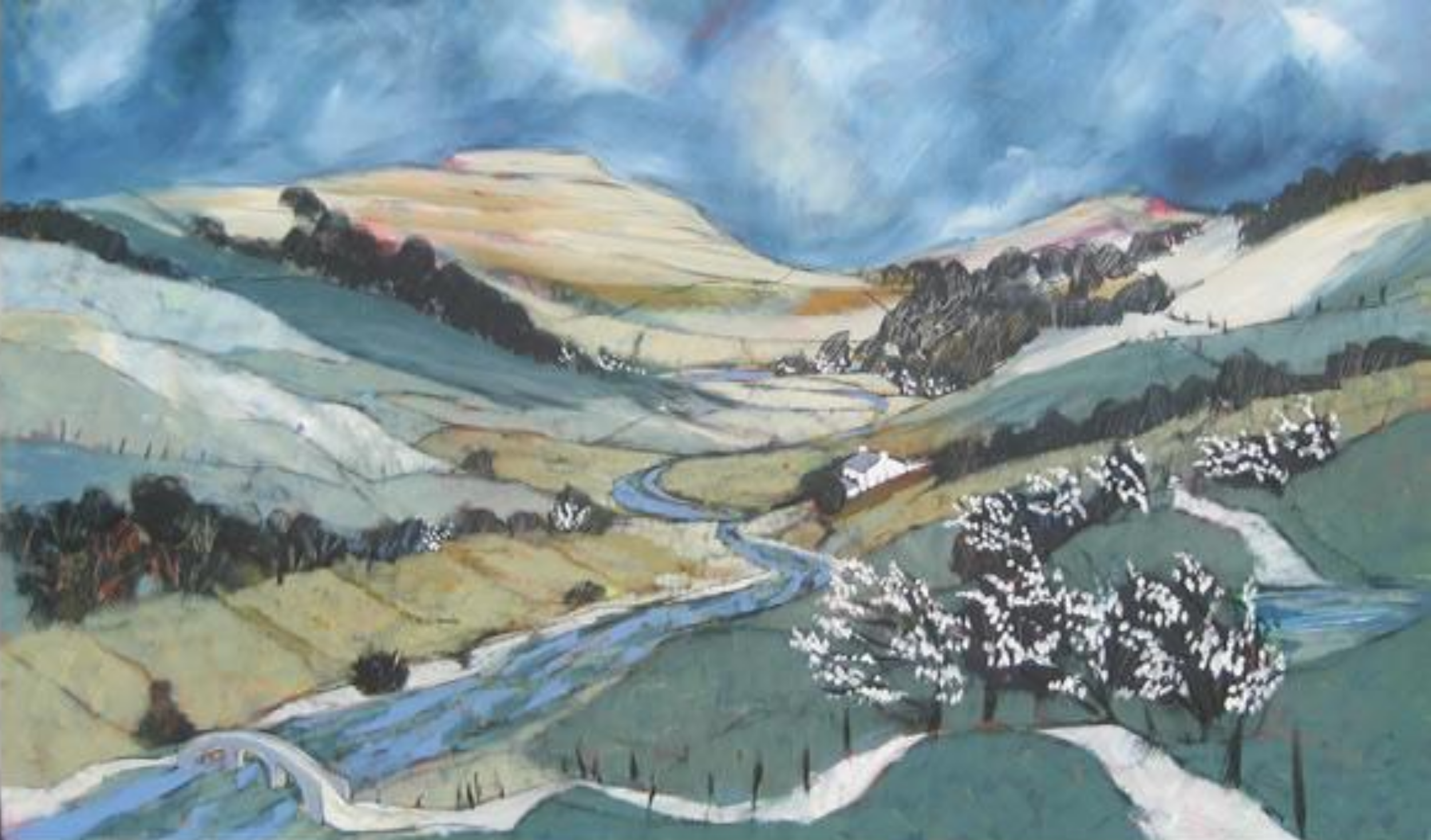
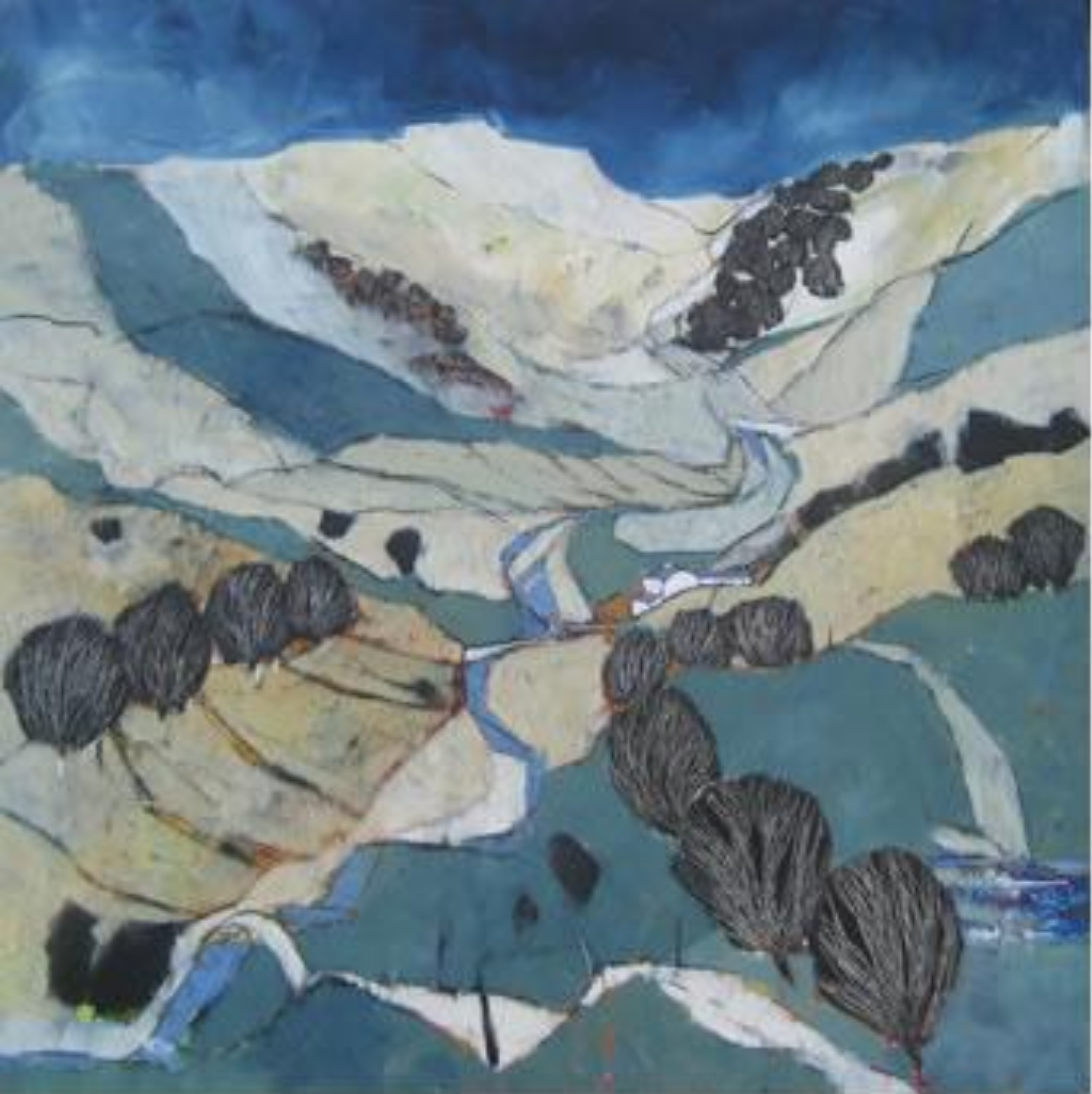
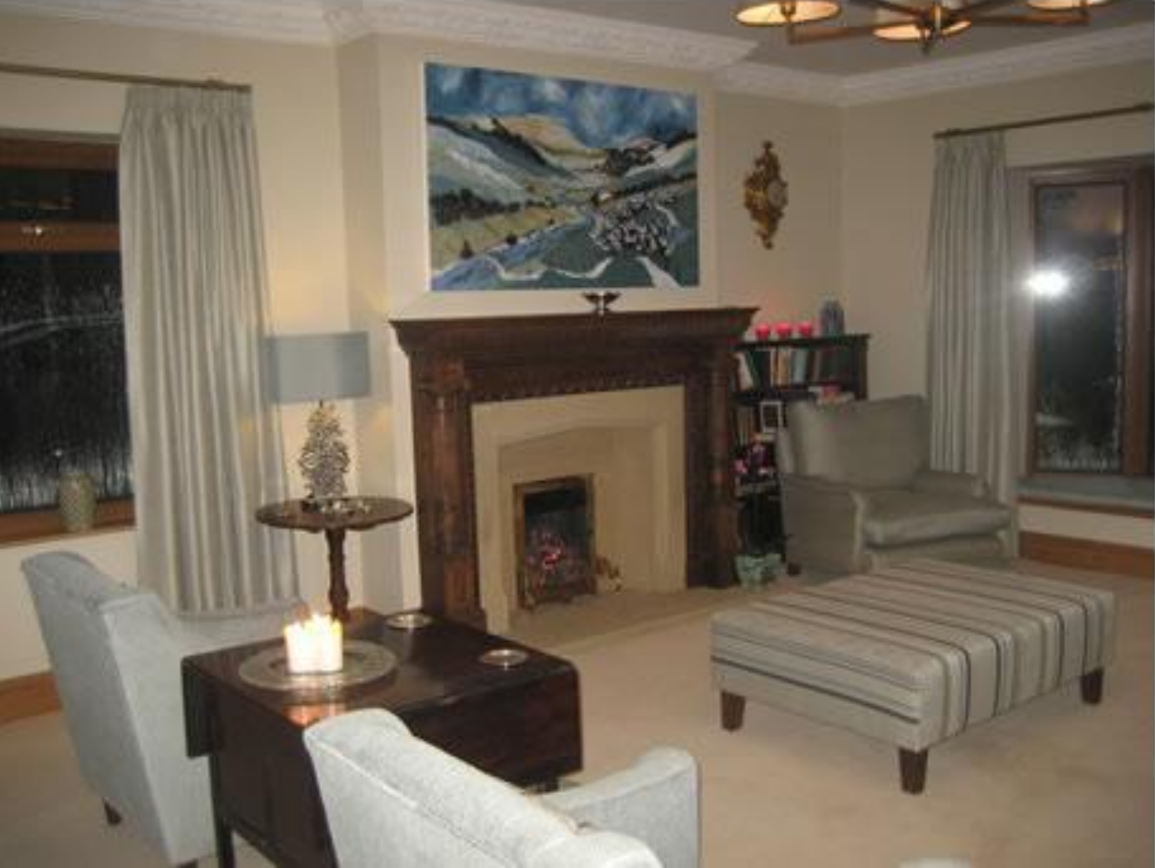
We are also doing a lot of commissions based on landscape, where the client loves our style but wants us to paint a view or area that has meaning for them personally. We can work from photos of a particular place or view, though where we can we like to visit the location ourselves to get a feel for the place.

We don't ask for a deposit or make any extra charges for commissions as we are really good at doing this and are confident you will love what we paint for you. If you don't like the finished piece there is no obligation to buy it.

The usual turn around time from initial commissioning to producing a finished piece is around six to eight weeks.

Lulworth Blue.png

SOME EXAMPLES OF RECENT COMMISSIONS:


A very straightforward and enjoyable commission.

We were asked to paint a still life based on a painting of ours to include pomegranates, olives, figs and lemons with irises as the main flower. Always a pleasure to paint these.


Now this was great.

Again based on a paper original, we made this painting on a huge 137 x 137 cm canvas for clients in Australia. They requested some very specific imagery of a crown, a slice of melon, a duck and a slice of salami!

We have no idea of the significance of these but it was fun to include them in the design.


Teresas Green.png


Original Painting


New Commission Painting


This painting on canvas was based closely on the one next to it, which was done originally on paper.

The client wanted a close copy with the addition of avocados. No problem!


This was a great excuse to go to Devon!  

We were asked to paint a view based on the clients favourite place there. This is looking across the river to Bantham with Burgh Island in the distance.

A beautiful place, and quite challenging to paint as there is a lot of space with not that much detail so it was fun trying to condense the imagery to make sure all the recognisable buildings were included while still retaining a sense of light and space.


Teresas Green.png


This was a nice commission.

Our client already had a painting of this view of Borrowdale in the Lake District and decided they would like a winter version of the same view. We revisited photographs and made this painting, adding in the pheasants for some colour and focus in the foreground.


Stonehaven on the east coast of Scotland.

We were asked to visit there and get a view of the town and Dunnottar Castle in the distance. Freezing when we visited but hopefully a sunnier image for the painting!


Teresas Green.png


These three were done to hang in a hallway.

They are based on our Greek series of paintings with Mediterranean themes and these three are linked with the sea and skyline running through the background to give continuity.

They were painted to go in a hallway so are quite small, 50 cm each, individually but run nicely along the wall as you go past them, giving a feeling of looking out onto the views.

We picked up a hint of the checked floor to tie them in too on the edges.


This is 91 x 91 cm on canvas. The client loved our still life paintings but wanted specific imagery so they chose a composition they liked from an existing painting and we used their ideas to make this piece for them.

Their list included lobster, crab, wine bottle, Camembert cheese, fish on a plate, blue hydrangeas and our trademark lemons. Great fun to do.


Teresas Green.png


Spring 2021 The River Dart

This is the view from above Dartmouth across the river to Kingswear. The client wanted to include the sweep of the view with the specific tree and flowers in the foreground and the Daymark spire in the distance.


Spring 2021 La Sorrueda (Gran Canaria)

This was great fun. We had to work from photos due to the everlasting Covid restrictions but the client sent us loads of photos and stipulated they wanted as much of the variety of plants included as possible.

The view takes in a favourite place there with the reservoir and mountains in the distance. We love the sense of heat in the painting and all those beautiful plants and flowers, so different from our UK landscapes.


Teresas Green.png
IMG_3508.jpg

Spring 2021 Still Life

This painting was commissioned for a specific place in the clients’ kitchen with a very specific colour scheme. We used an existing still life painting from a few years ago as a start point and then added to that.

The painting is a little crowded as there was a long list of imagery to include so we had great fun getting it all in. I particularly enjoyed painting the walnuts - new for us, and although the overall colour is unusual for us it worked really well and looks great on their wall!


October 2020 Woodbridge

This was painted for a client who lived in Woodbridge in Suffolk for many years and has since moved and wanted a reminder of the town.

The main imagery was to include the water with the tide mills and the town with a view from the river walks that are so memorable for them.

It was painted from photographs rather than visiting as we usually would due to Covid restrictions, so we were anxious to get it right. The clients loved it so I guess we did! 

Click the image above for a close up view.


Teresas Green.png
EMBSAY+CRAG 2020.jpg

SUMMER 2020 EMBSAY CRAG, YORKSHIRE

This was a nice one for us. Our clients wanted a reminder of the crag at the little village of Embsay, just 30 minutes from where we live. It’s a familiar area though a new view for us and it was a pleasure to work so close to home. The brief was to capture the view from the village looking up to the crag and to include cow parsley, cow slips and a hint of bluebells. The swifts in the sky were also requested as a fond reminder, and the horses had to be there as that’s where they live! The painting is now hanging in the clients’ house in Boston, USA and is hopefully bringing a little bit of Yorkshire to their home.


 JANUARY 2020 CORNWALL

We were asked to visit the Penwith area of Cornwall for this. Our clients are big fans of walking and this area is very special to them They gave us a HUGE list of imagery they wanted to include and we spent a happy week wandering around the coast and inland paths taking getting photos and working out ideas for this piece.

As you can see, we had a big challenge to fit in everything but we love the sense of space and distance the painting has and I have found a great way to paint gorse! The final title was “Sennen Cove to Botallack and everything in between” which pretty much sums it up!

The clients were delighted with the finished painting and so were we!

Click the image above for a close up view.


Teresas Green.png
 

 OCTOBER 2019

Suffolk, late summer.

This painting is based on an area of Suffolk looking out over reed beds and Blythbrough Church to the coast with late summer flowers and a classic "Crinkle Crankle” wall in the foreground.

We were asked to give a feel of the area rather than a specific view so this is a composite of images and ideas based on our stay in the area and using the clients request for the flowers, church, wall, reed beds, fields and hay bales with a couple of pheasants somewhere.

We wanted to give the feel of late summer and the lanes and beautiful rolling countryside and its now hanging in a gorgeous Suffolk farmhouse kitchen.

Click the image below to see it close up.


 AUTUMN 2019

This is a valley 15 minutes from where we live in Yorkshire and we never knew it existed!

Our clients visited us at our studio and loved our landscapes but wanted something very personal to them.

This is the Crimple Valley, just down the road from us but so hidden and tucked away it was a complete surprise to find it.

The clients love this particular place as it is their favourite walk and wanted us to capture the feel of the place, with summer fields and the folds of the hills leading down to the stream.

The rock outcrop is a very prominent feature here, called Almscliffe Crag, its always a sign of home to me and obviously means the same to the clients.

Click the image below to see it up close…

Aut 2019 1.jpg


Green Blue.png
 

 SUMMER 2019 - KIONI

This was a joy to do. The clients visited us at our open studio at home and asked us if we would go to the Greek Island of Ithaca, where they had very happy memories of staying in the tiny little harbour village called Kioni.

They wanted us to paint our take on the harbour and particularly love the vibrant pink of the bougainvillea and the boats flicking through the turquoise water there.

We of course agreed to go and spend some time there and had a beautiful week in this lovely place, made sketches and took photos and ate too much and swam in that blue sea everyday.

It was easy to come home and paint this for them, and the bougainvillea and harbour theme has spilled over into many paintings since.

Kioni.jpg
 
 
Beadnell 2018 (Winter).jpg

 WINTER 2018

This painting was done for a client who already has several paintings from us so was happy for us to let rip! They have a house next to the beach in Northumberland and wanted a representation of all the things they love about the place.

It happens to be one of our favourite places too so we spent a happy couple of days running around on the beach and soaking it all in.

We have their house in the foreground and dog on the beach with the harbour and coastline showing Dunstanburgh Castle in the distance and lots of boats and kite surfers and birds giving the painting movement.

Love the colours in this one especially.

 
Teresas Green.png
 

 AUTUMN 2018

Now this was a great commission for us - we were asked to paint the client's house in the Lake District and they wanted the view looking across the valley with their house in the centre.

They really like our landscape paintings but wanted something more personal to them. We went and stayed in the house for a few days and measured up and enjoyed a great visit to a very old and beautiful Lake District cottage.

It was really useful to get a good idea of how the painting would work and then made this in the studio afterwards.  It's another fairly big piece and always great fun to paint at that size and included imagery important to the client:

The house, obviously, the distant mountain range, the pond, the little birds in the foreground and the view back to the house from there.

Fiona Pashley 2018 (Autumn).jpg


autumn 2018

 
Fiona Pashley 2018 (Autumn).jpg
 
Fiona Pashley room (Autumn).jpg
 

 The client here loved our landscape paintings and wanted something big for their space at home. They particularly liked the painting above left so we based their painting on that with a similar view and imagery.

The painting commissioned was much bigger and a rectangular format but uses the same colours and feel to give the sense of space and distance that all our paintings have. They sent us the image above of it hanging in its new home and looking spiffy!

 
Teresas Green.png


SUMMER 2018

This commission was done for a very specific place at the top of a staircase.

The image was chosen from an existing painting and adapted for this format. It was fantastic to do as it was a real challenge getting all the distance and sense of space in despite the tight framework.

It measured over 6 feet high so was quite imposing when it was finished and you get a real sense of walking into the landscape as you go up the stairs and it emerges at the top.

Kate and Andrew 2018 (Summer).jpg
 
 
Breakfast Table 2018 (Spring).jpg


SPRING 2018

This was commissioned for a gift for a client's husband, and she sent photos of the room it would hang in and all the items personal to her that she wanted in the painting: Figs, tomatoes, red onion, green plate, two jugs, wooden board with avocados, cheese, tulips, silver teapot, knife, daffodils, glass of  Bucks Fizz, spotted tablecloth and a border from cloth that she had from India.

All in a 76 x 76 cm painting, so that was fun! The challenge here was to get everything in and maintain a pleasing composition and hopefully not make it overly crowded. We thought it worked out really well and so did the client.

 
Green Blue.png
 

spring 2018


jen schneck original 2 (Autumn).jpg

Original Painting

 
Jennifer Schneck 2019 (Autumn 2018).jpg
 

Our Painting

 This painting was done based on the smaller original above. The client really liked the original 91 x 91 cm painting with the chillies and textile influences but wanted something bigger. We made a slightly bigger piece at 107 x 107 cm for her based on this instruction.


Chevin Commission web image (Dec 2017).jpg


DECEMBER 2017

This was a lovely commission for us as it is a painting of our hometown in Yorkshire, commissioned by a client who lives locally. They wanted the view from our local hill looking back over the town.

They had admired our snow landscapes before and requested that we use a similar colours and imagery to create this piece. Conveniently, it was actually snowing when we went up there to take photos to work from so it worked really well! 

The pheasant and the rose hips and hawthorn berries add a splash of warmth to an otherwise cool palette and it hopefully captures the feel of the landscape of Wharfedale.

 
Green Blue.png


AUGUST 2017

This painting was based on an painting that the client loved, with the bright turquoise and the composition of fruit and flowers, but the original had a plate of fish in the centre, which, as a vegetarian, she didn't like so much!

We did this piece for her using the same colours and imagery as the original, but changing the fish for figs.

Evie's painting web image (Aug 17).jpg


Summer 2017.jpg


SUMMER 2017

This was a painting done for a client who wanted a reminder of the view from his Grandmother's house in a lovely corner of Cornwall. He had happy memories of holidays spent there and, as his Grandmother had recently died, a place that he wouldn't be able to revisit anymore. It was obviously important that we get it just right and so we visited the house and then worked closely from a list to include everything of importance for him (the view, the cows, the pheasant,the flowers, the terrace etc).

This is the result and the client was delighted with it so we hopefully got the atmosphere and sense of place across and he will has a reminder of an important place for him.

 
Teresas Green.png


NOVEMBER 2016

Back in the lovely Cotswolds for our second commission there.

This is a view of Chipping Campden from the hill above. The client likes our Yorkshire landscape paintings and wanted a similar style and palette to capture the feeling of the town nestling in the bowl of the countryside and this is based on a series of photos we took from her favourite view there. 

Chipping Campden Commission small (Nov 2016).jpg
 
 
Lucy & Gordon Final small (Sept 2016).jpg


SEPTEMBER 2016

This one required us to go to the south of France and visit the clients in their amazing home there.

The painting measures 5 foot x 5 foot so we had a good bit of canvas to go at, which was fortunate as they had a long list of imagery and wanted a painting for their London house that will take them back to France whenever they look at it.

So, we have the house and pool, the distant river in the valley, waterfalls, two villages, deer, buzzards, bees, figs, Charolais cattle, lavender, and the distant Pyrenees. It was a joy to paint (and to visit) and we hope we captured all the summer atmosphere of the place. 

 
Green Blue.png


SUMMER 2016

This was fun. Our client said he'd been looking for a painting with, very specifically, crab, lobster, white wine, watercress and lemons as a reminder of many happy meals.

Not surprisingly he hadn't found one.

So we set out to paint it for him. It is based on the format of our other still life paintings and includes all his requested imagery. We love the looseness of the finished image and the crab has featured in a couple of other pieces since.

Summer 2016.jpg
 

A big one this, 7 foot x 5 foot, painted in our new studio with loads of light and lovely high ceilings so it was a great test for the space. It was based on the client's garden in Somerset with the pond as the centrepiece.

They wanted an idea of the seasons passing within the painting so we have the blossom of the spring trees on the right, going through the full colour of the flowers in summer in the centre and then autumnal colour on the left. Loved painting the flowers and the crazy mix of colours.

It's led to an obsession with painting irises too! They featured a lot in our recent still life paintings.


2045028543Appletreewick commission 2015 small (Aug 15).jpg


AUGUST 2015

This was another big piece which was lovely to paint as it has real depth and scope. It is a painting of the River Wharfe at Appletreewick in the Yorkshire Dales and was commissioned to hang in the home of a client who lives in Luxembourg but wanted a reminder of their Yorkshire roots.

This place holds happy memories for them and if you look closely, we included the campsite by the river at the clients request! 

 
Green Blue.png


NOVEMBER 2014

This commission was designed to be the focal point in a double height living room. The colours echo the surroundings and the imagery was chosen from a previous painting based on the South of France.

The size of the canvas at 6ft 6" x 5ft x 3" allowed us lots of room to make a painting with a lot of depth and space. We particularly liked the lily pond as we have painted these before but this one has a lovely loose quality.

Rebecca Heaney commission small (Nov 14).jpg
 
 
Newcastle small (Oct 14).jpg

 OCTOBER 2014

Now this was a cracker.........The client wanted a painting as a memory of much loved places in Newcastle and the coast to the north. The brief was to include the quayside, the river, the bridges, Jesmond Dene park, the hospital, the coast of Northumberland, a reference to Newcastle United Football club and some puffins. So, no pressure there then!

We had a 5 foot x 4 foot canvas so we had some space and scope to work with. The magpies represent the football club and the overview is a birds eye view of the city and beyond. We were a bit worried that the break between the city and the coast wouldn't look right but using the puffins and magpies to break the line worked really well and we are really pleased with the result. The client is really happy too!!

 
Teresas Green.png
 

 AUGUST 2014


This is the biggest painting we have done so far and it was a real joy for us to paint on this scale. The painting was commissioned by a client who already has eleven of our big paintings and wanted a bespoke piece for a north facing room in their home that would bring some colour and warmth to an otherwise neutral palette.

We went to their house to see the location for the painting and we decided together that 10 feet x 6 feet would be a perfect size for the wall they had in mind. After looking at images of other paintings of ours they decided to go with the image from the commission in October 2013 which we used as a basis for this piece.

We added more imagery and were aiming for a silver / grey background with hits of bright colour and a flow through the painting so there is no one central image. We've added some photos of the painting process in our studio as well as the finished piece in the clients house.

It was a great experience and we're really proud of the painting as it was about as big as we can manage in our studio!!                                                

Check out the making of this one below…


1731555173susan panorama.jpg
 
1496282596susan 6.jpg

…AND WE’RE DONE!


 JULY 2014

This was a lovely commission. We were asked to do a painting based on the existing one to the right but including various images provided by the client. They supplied us with the photos below and asked us to incorporate the bowls and jugs in the painting along with pomegranates, dandelion clocks, and bluebells.

Below are the images we were asked to include…

This was the original we were asked to base our version on.

This was the original we were asked to base our version on.


tirrie web site July 14.jpg

You can see how well it worked in the finished painting to the right here.

We really enjoyed the challenge of using someone else's images and the client loved having a such a personal input and has a painting which means a lot to them and their family.

We would love to do more pieces like this so if you have any ideas just let us know!


Green Blue.png


APRIL 2014

The brief here was to paint the landscape in the Peak District for the client.

They asked for the view to include specific details like the viaduct set in the landscape they love near Sheffield with a more vivid green in the fields than we normally use. 

This was a great commission because Christine grew up in this area and it was fun to paint an area we know so well.

1554232756Sheffield Commission small (April 14).jpg
 
 
Cotswold Commission small (March 14).jpg

 MARCH 2014

This commission is based on an area of the Cotswolds near the client's house.

They asked us to visit a few different places in the area and make a painting for them. We spent a few days there to get a feel for the place and took lots of photos so we could make this painting when we got back to our studio.The image is based on journey through the Coln Valley and the villages of Coln Rogers and Coln St Denis.

The sky is lighter and the landscape reminiscent of our Tuscany paintings at the client's request.

 
Teresas Green.png
 

 NOVEMBER 2013

The brief here was to paint the clients house in Singapore – one of the old colonial “Black and White” houses set in beautiful lush gardens. We visited the house and, back in the UK, worked from photographs to produce the painting.


white wells commission (Aut 13).jpg

 AUTUMN 2013

The client loved our square landscape paintings and wanted to commission a personal piece.

The brief was to take a favourite walk on Ilkley Moor and condense the view to include all the main points of the walk rather than just a painting of the view.

The rectangular format really helped here.

 
Green Blue.png
 

 OCTOBER 2013

The clients really liked a small square painting based on a garden in the South of France. We took that image and with the clients ideas, we made a bigger painting, rectangular and with altered colours but the same imagery.

commission-oct2013.jpg


 SUMMER 2012

The brief was to produce a series of different sized paintings that would hang well together on a long wall and which reflect the architecture and imagery of Cambridge.

After an initial consultation and visit to the place the paintings would hang, we spent time in Cambridge taking photos and making sketches to produce this series of paintings for the hospital teaching wing.

Untitled design-33.png
 
Untitled design-35.png
 
Green Blue.png
 

 SUMMER 2012

The brief was to produce a rectangular painting based on an existing square image of an earlier painting.

We were also asked to soften the final image by adding the hawthorn blossom to the foreground.


 DECEMBER 2011

The brief here was to work from photographs of a village in Southern Spain where the clients had spent their honeymoon and produce a painting that reflected the colour and scenery of that place.

They specified the size, sent us a series of photos and left us to make our own interpretation from that.

Gaucin, Andalucia.jpg
 
Green Blue.png